Annotated Screenshots of Workzone's New Interface
On March 31, 2017, Workzone will be releasing a major update to its design. The new Workzone interface is cleaner, simpler and more modern, with larger, easier-to-read type. We’ve simplified the interface to give easier access to the most-used features. View a high-level overview of the changes, including basic screenshots (without annotations).
Top Navigation

1. Click this section for workspaces drop-down menu. Double click to go to All Workspaces view. Welcome Page (previous single-click action, can now be accessed in profile menu (top right).
2. Simple icons give quick visual cues to main modules.
3. Setup (gear icon) and Favorites (star icon) moved to secondary navigation section.
4. New “profile” menu for user gives quick access to “My Info”, “My Timesheet”, “My To-Do List”, and other frequently used pages. These links were previously at the bottom center of the page.
Projects
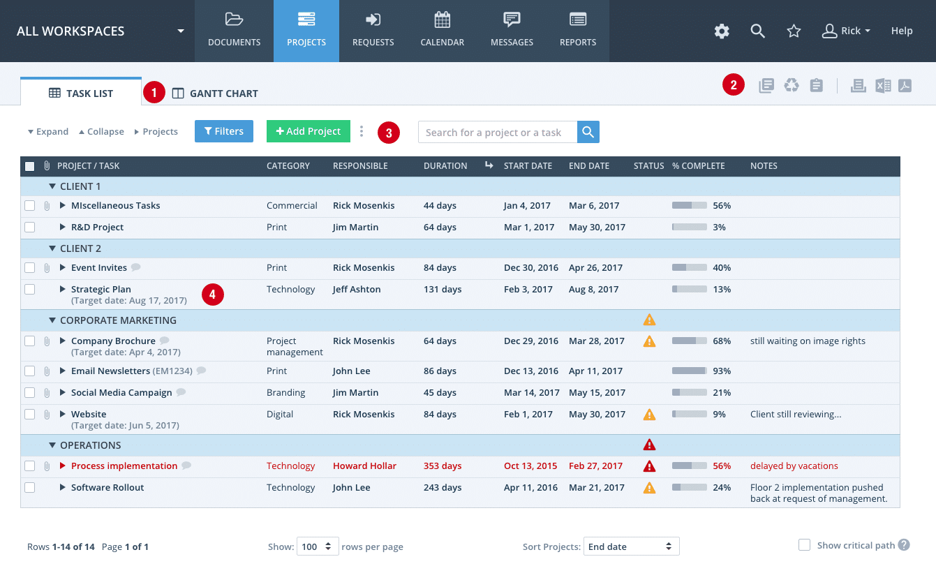
Default View

1. Tabs at top switch between Task List and Gantt Chart views.
2. Icon links to Project Templates, Project Recycle Bin, and Project List.
3. Buttons only seen when active — initially only Add Project and Filters are visible. Additional buttons appear automatically when a row is selected (see next screenshot).
4. Task List font is now larger and more readable. Simplified, more modern design make this powerful page more accessible.
Hidden Buttons Exposed When Rows Are Checked

1. Additional buttons appear automatically when a row is selected.
2. Mouse over a workspace, project or task name to get a “More” drop-down menu with additional options (icon with 3 stacked dots).
Filters Made More Prominent and More Powerful

1. Filters have been given a more prominent place in Projects and throughout Workzone.
2. The redesigned Filters page makes it easier to select the most frequently-used filters, while still providing access to more advanced options.
Documents
File List

1. Text is larger and easier to read.
2. Larger, clearer file type icons.
3. Less frequently-used buttons accessible via “More” menus (icon with 3 stacked dots).
4. Approvals and image markup easier to see in their own columns.
5. Clicking item name now goes to comments/details page (previously opened item).
Document Comments/Details Page (other comments/details pages have similar design)

1. Comments show user picture (or initials). Set up under “My Info” on user profile menu (top right of the page).
2. Larger, more readable type.
3. Reorganized details section makes information easier to find.
Custom Project Request Forms

1. Larger, more readable type. Improved formatting for mobile devices as well.
2. “Verify you are a human” section for public forms now works properly on touch screens.